Data Visualization Best Practices (Coursera)

Data Visualization Best Practices (Coursera)

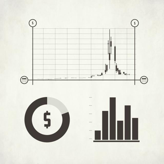
In this course, we will cover the basics of visualization and how it fits into the Data Science workflow. We will focus on the main concepts behind the purpose of visualization and the design principles for creating effective, easy-to-communicate results. You will also set up your Tableau environment, practice data loading, and perform univariate descriptive analysis of the S&P 500 stock sectors.

Class Deals by MOOC List - Click here and see Coursera's Active Discounts, Deals, and Promo Codes.

Course 1 of 3 in the Use Tableau for Your Data Science Workflow Specialization.

Syllabus

WEEK 1
Visualization Fundamentals
Visualization is a crucial skill for data analysts across all disciplines. Viewing data graphically often provides greater intuition than by using statistics or mathematics alone. In this module, we’ll explore the fundamentals of visualization and discuss how visualizations can achieve better insight into data as well as effectively communicate results and conclusions.

WEEK 2
Design Principles for Effective Visualizations
To create effective visuals, analysts must understand and be able to explain why specific graphical elements must be included, eliminated, or modified. In this module, we’ll investigate why certain questions are best answered by specific visual cue patterns, discuss which psychological perception theories should be considered during the construction of data visualizations, and cover the universal framework for representing visual data, the grammar of graphics.

WEEK 3
Univariate Visualization Methods
Univariate visualization methods apply the grammar of graphics to the representation of a dataset’s fundamental properties and structures in terms of single variable mappings to visual encodings. In this module, we’ll explore specifics for how to view the data and what to visualize and discuss what mapping of data is best suited for highlighting and extracting insights from the data.

WEEK 4
Standard Univariate Visualizations
Instead of reinventing the wheel with every visualization, analysts use several common chart types so there is no ambiguity about the decoding and interpretation of the data. In this module, we'll explore some standard tools and techniques that are used to prepare a fully crafted set of visualizations for the purpose of storytelling. Before completing this module, you will use Tableau to conduct a univariate analysis to sample data, compare dimensions vs. measures, and practice linking visualizations.

Go to Class
MOOC List is learner-supported. When you buy through links on our site, we may earn an affiliate commission.

Related Courses

Math for MBA and GMAT Prep (Coursera) Coursera
Emory University

Math for MBA and GMAT Prep (Coursera)

This course gives participants a basic understanding of statistics as they apply in business situations. A fair share of students considering MBA programs come from backgrounds that do not include a large amount of training in mathematics and statistics. Often, students find themselves at a disadvantage when they apply for or enroll in MBA programs. This course will give you the tools to understand how these business statistics are calculated for navigating the built-in formulas that are included in Excel, but also how to apply these formulas in an range of business settings and situations.

Jun 15th 2026
5-12 Weeks
Data-driven Decision Making (Coursera) Coursera
PwC

Data-driven Decision Making (Coursera)

Welcome to Data-driven Decision Making. In this course, you'll get an introduction to Data Analytics and its role in business decisions. You'll learn why data is important and how it has evolved. You'll be introduced to “Big Data” and how it is used. You'll also be introduced to a framework for conducting Data Analysis and what tools and techniques are commonly used. Finally, you'll have a chance to put your knowledge to work in a simulated business setting. This course was created by PricewaterhouseCoopers LLP with an address at 300 Madison Avenue, New York, New York, 10017.

Jun 15th 2026
4 Weeks
Python and Statistics for Financial Analysis (Coursera) Coursera
The Hong Kong University of Science and Technology - HKUST

Python and Statistics for Financial Analysis (Coursera)

Python is now becoming the number 1 programming language for data science. Due to python’s simplicity and high readability, it is gaining its importance in the financial industry. The course combines both python coding and statistical concepts and applies into analyzing financial data, such as stock data.

Jun 15th 2026
4 Weeks
Fundamentals of Visualization with Tableau (Coursera) Coursera
University of California, Davis

Fundamentals of Visualization with Tableau (Coursera)

In this first course of the specialization, you will discover just what data visualization is, and how we can use it to better see and understand data. Using Tableau, we’ll examine the fundamental concepts of data visualization and explore the Tableau interface, identifying and applying the various tools Tableau has to offer.

Jun 15th 2026
4 Weeks
Data Visualization and Communication with Tableau (Coursera) Coursera
Duke University

Data Visualization and Communication with Tableau (Coursera)

One of the skills that characterizes great business data analysts is the ability to communicate practical implications of quantitative analyses to any kind of audience member. Even the most sophisticated statistical analyses are not useful to a business if they do not lead to actionable advice, or if the answers to those business questions are not conveyed in a way that non-technical people can understand. In this course you will learn how to become a master at communicating business-relevant implications of data analyses.

Jun 15th 2026
5-12 Weeks
Introduction to the Tidyverse (Coursera) Coursera
Johns Hopkins University

Introduction to the Tidyverse (Coursera)

This course introduces a powerful set of data science tools known as the Tidyverse. The Tidyverse has revolutionized the way in which data scientists do almost every aspect of their job. We will cover the simple idea of "tidy data" and how this idea serves to organize data for analysis and modeling. We will also cover how non-tidy can be transformed to tidy data, the data science project life cycle, and the ecosystem of Tidyverse R packages that can be used to execute a data science project.

Jun 15th 2026
4 Weeks
Visualizing Data in the Tidyverse (Coursera) Coursera
Johns Hopkins University

Visualizing Data in the Tidyverse (Coursera)

Data visualization is a critical part of any data science project. Once data have been imported and wrangled into place, visualizing your data can help you get a handle on what’s going on in the data set. Similarly, once you’ve completed your analysis and are ready to present your findings, data visualizations are a highly effective way to communicate your results to others. In this course we will cover what data visualization is and define some of the basic types of data visualizations.

Jun 15th 2026
4 Weeks
Advanced Data Visualization with R (Coursera) Coursera
Johns Hopkins University

Advanced Data Visualization with R (Coursera)

Data visualization is a critical skill for anyone that routinely using quantitative data in his or her work - which is to say that data visualization is a tool that almost every worker needs today. One of the critical tools for data visualization today is the R statistical programming language. Especially in conjunction with the tidyverse software packages, R has become an extremely powerful and flexible platform for making figures, tables, and reproducible reports. However, R can be intimidating for first time users, and there are so many resources online that it can be difficult to sort through without guidance.

Jun 15th 2026
3 Weeks
Data Visualization with R (Coursera) Coursera
IBM

Data Visualization with R (Coursera)

In this course, you will learn the Grammar of Graphics, a system for describing and building graphs, and how the ggplot2 data visualization package for R applies this concept to basic bar charts, histograms, pie charts, scatter plots, line plots, and box plots. You will also learn how to further customize your charts and plots using themes and other techniques. You will then learn how to use another data visualization package for R called Leaflet to create map plots, a unique way to plot data based on geolocation data. Finally, you will be introduced to creating interactive dashboards using the R Shiny package.

Jun 15th 2026
4 Weeks
Getting Started with Data Visualization in R (Coursera) Coursera
Johns Hopkins University

Getting Started with Data Visualization in R (Coursera)

Data visualization is a critical skill for anyone that routinely using quantitative data in his or her work - which is to say that data visualization is a tool that almost every worker needs today. One of the critical tools for data visualization today is the R statistical programming language. Especially in conjunction with the tidyverse software packages, R has become an extremely powerful and flexible platform for making figures, tables, and reproducible reports. However, R can be intimidating for first time users, and there are so many resources online that it can be difficult to sort through without guidance.

Jun 15th 2026
3 Weeks
Data Visualization with Tableau Project (Coursera) Coursera
University of California, Davis

Data Visualization with Tableau Project (Coursera)

In this project-based course, you will follow your own interests to create a portfolio worthy single-frame viz or multi-frame data story that will be shared on Tableau Public. You will use all the skills taught in this Specialization to complete this project step-by-step, with guidance from your instructors along the way.

Jun 15th 2026
5-12 Weeks
Fundamentals of GIS (Coursera) Coursera
University of California, Davis

Fundamentals of GIS (Coursera)

Explore the world of spatial analysis and cartography with geographic information systems (GIS). What you will learn: define core geospatial concepts; practice with subset data using selections and feature attributes; create map books using advanced mapping techniques; create layer and map packages.

Jun 15th 2026
4 Weeks