Advanced Data Visualization with R (Coursera)

Advanced Data Visualization with R (Coursera)

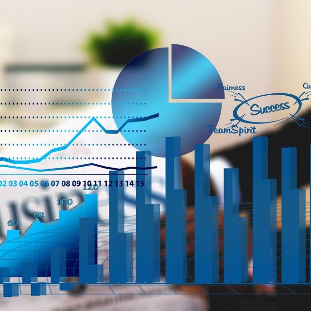
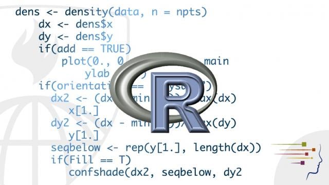
Data visualization is a critical skill for anyone that routinely using quantitative data in his or her work - which is to say that data visualization is a tool that almost every worker needs today. One of the critical tools for data visualization today is the R statistical programming language. Especially in conjunction with the tidyverse software packages, R has become an extremely powerful and flexible platform for making figures, tables, and reproducible reports. However, R can be intimidating for first time users, and there are so many resources online that it can be difficult to sort through without guidance.

Class Deals by MOOC List - Click here and see Coursera's Active Discounts, Deals, and Promo Codes.

This course is the third in the Specialization "Data Visualization and Dashboarding in R." Learners come into this course with a foundation using R to make many basic kinds of visualization, primarily with the ggplot2 package. Accordingly, this course focuses on expanding the learners' inventory of data visualization options. Drawing on additional packages to supplement ggplot2, learners will made more variants of traditional figures, as well as venture into spatial data. The course ends make interactive and animated figures.
To fill that need, this course is intended for learners who have little or no experience with R but who are looking for an introduction to this tool. By the end of this course, students will be able to import data into R, manipulate that data using tools from the popular tidyverse package, and make simple reports using R Markdown. The course is designed for students with good basic computing skills, but limited if any experience with programming.
Course 3 of 5 in the Data Visualization & Dashboarding with R Specialization

Syllabus

WEEK 1
Advanced Figures with ggplot2
In this module, we will work through making a number of different figures using ggplot2 and a few additional R packages. You should begin by watching the introductory videos in each lesson. Then, carefully review the readings and reference materials provided. Once you have done that, I recommend watching the videos again to check your understanding. You will take a few quizzes as you progress through the material to make sure you are keeping up.

WEEK 2
Spatial Data
In this module, we go through an introduction for making spatial figures (maps) in R. You should begin by watching the introductory videos in each lesson. Then, carefully review the readings and reference materials provided. Once you have done that, I recommend watching the videos again to check your understanding. You will take a few quizzes as you progress through the material to make sure you are keeping up.

WEEK 3
Plotly and gganimate
In this module, we will work on animating figures and making them interactive. You should begin by watching the introductory videos in each lesson. Then, carefully review the readings and reference materials provided. Once you have done that, I recommend watching the videos again to check your understanding. You will take a few quizzes as you progress through the material to make sure you are keeping up.

Go to Class
MOOC List is learner-supported. When you buy through links on our site, we may earn an affiliate commission.

Related Courses

Social Media Data Analytics (Coursera) Coursera
University of Washington

Social Media Data Analytics (Coursera)

Learner Outcomes: After taking this course, you will be able to: utilize various Application Programming Interface (API) services to collect data from different social media sources such as YouTube, Twitter, and Flickr; process the collected data - primarily structured - using methods involving correlation, regression, and classification to derive insights about the sources and people who generated that data; analyze unstructured data - primarily textual comments - for sentiments expressed in them; use different tools for collecting, analyzing, and exploring social media data for research and development purposes.

Jun 1st 2026
4 Weeks
Fundamentals of Visualization with Tableau (Coursera) Coursera
University of California, Davis

Fundamentals of Visualization with Tableau (Coursera)

In this first course of the specialization, you will discover just what data visualization is, and how we can use it to better see and understand data. Using Tableau, we’ll examine the fundamental concepts of data visualization and explore the Tableau interface, identifying and applying the various tools Tableau has to offer.

Jun 1st 2026
4 Weeks
Practical Machine Learning (Coursera) Coursera
Johns Hopkins University

Practical Machine Learning (Coursera)

One of the most common tasks performed by data scientists and data analysts are prediction and machine learning. This course will cover the basic components of building and applying prediction functions with an emphasis on practical applications. The course will provide basic grounding in concepts such as training and tests sets, overfitting, and error rates.

Jun 1st 2026
4 Weeks
Designing, Running, and Analyzing Experiments (Coursera) Coursera
University of California, San Diego

Designing, Running, and Analyzing Experiments (Coursera)

You may never be sure whether you have an effective user experience until you have tested it with users. In this course, you’ll learn how to design user-centered experiments, how to run such experiments, and how to analyze data from these experiments in order to evaluate and validate user experiences. You will work through real-world examples of experiments from the fields of UX, IxD, and HCI, understanding issues in experiment design and analysis.

Jun 1st 2026
5-12 Weeks
Visual Analytics with Tableau (Coursera) Coursera
University of California, Davis

Visual Analytics with Tableau (Coursera)

In this third course of the specialization, we’ll drill deeper into the tools Tableau offers in the areas of charting, dates, table calculations and mapping. We’ll explore the best choices for charts, based on the type of data you are using. We’ll look at specific types of charts including scatter plots, Gantt charts, histograms, bullet charts and several others, and we’ll address charting guidelines.

Jun 1st 2026
4 Weeks
Demand Analytics (Coursera) Coursera
Rutgers University

Demand Analytics (Coursera)

Welcome to Demand Analytics - one of the most sought-after skills in supply chain management and marketing! Through the real-life story and data of a leading cookware manufacturer in North America, you will learn the data analytics skills for demand planning and forecasting.

Jun 1st 2026
4 Weeks
Building on the SIR Model (Coursera) Coursera
Imperial College London

Building on the SIR Model (Coursera)

The other two courses in this specialisation require you to perform deterministic modelling - in other words, the epidemic outcome is predictable as all parameters are fully known. However, this course delves into the many cases – especially in the early stages of an epidemic – where chance events can be influential in the future of an epidemic.

Jun 1st 2026
4 Weeks
Python Data Visualization (Coursera) Coursera
Rice University

Python Data Visualization (Coursera)

This if the final course in the specialization which builds upon the knowledge learned in Python Programming Essentials, Python Data Representations, and Python Data Analysis. We will learn how to install external packages for use within Python, acquire data from sources on the Web, and then we will clean, process, analyze, and visualize that data. This course will combine the skills learned throughout the specialization to enable you to write interesting, practical, and useful programs.

Jun 1st 2026
4 Weeks
Exploratory Data Analysis (Coursera) Coursera
Johns Hopkins University

Exploratory Data Analysis (Coursera)

This course covers the essential exploratory techniques for summarizing data. These techniques are typically applied before formal modeling commences and can help inform the development of more complex statistical models. Exploratory techniques are also important for eliminating or sharpening potential hypotheses about the world that can be addressed by the data.

Jun 1st 2026
4 Weeks
Reproducible Research (Coursera) Coursera
Johns Hopkins University

Reproducible Research (Coursera)

This course focuses on the concepts and tools behind reporting modern data analyses in a reproducible manner. Reproducible research is the idea that data analyses, and more generally, scientific claims, are published with their data and software code so that others may verify the findings and build upon them. The need for reproducibility is increasing dramatically as data analyses become more complex, involving larger datasets and more sophisticated computations.

Jun 1st 2026
4 Weeks