Coursera
Johns Hopkins University
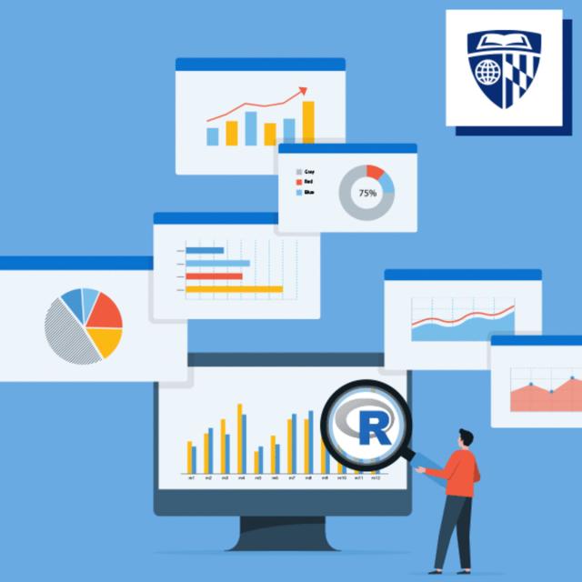
Advanced Data Visualization with R (Coursera)
Unlock the potential of your quantitative data with 'Advanced Data Visualization with R'. This comprehensive online course equips learners with the skills to transform raw data into insightful visual narratives using R, a versatile statistical tool. Perfect for professionals who work with numbers daily, this program demystifies R and the tidyverse packages, empowering you to create professional-grade figures, tables, and reports.