Publishing Visualizations in R with Shiny and flexdashboard (Coursera)

Publishing Visualizations in R with Shiny and flexdashboard (Coursera)

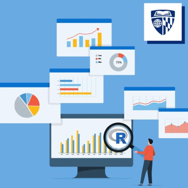
This course is the fourth in the Specialization "Data Visualization and Dashboarding in R." Learners will come to this course with a strong background in making visualization in R using ggplot2. To build on those skills, this course covers creating interactive visualization using Shiny, as well as combining different kinds of figures made in R into interactive dashboards. Data visualization is a critical skill for anyone that routinely using quantitative data in his or her work - which is to say that data visualization is a tool that almost every worker needs today.

Class Deals by MOOC List - Click here and see Coursera's Active Discounts, Deals, and Promo Codes.

One of the critical tools for data visualization today is the R statistical programming language. Especially in conjunction with the tidyverse software packages, R has become an extremely powerful and flexible platform for making figures, tables, and reproducible reports. However, R can be intimidating for first time users, and there are so many resources online that it can be difficult to sort through without guidance.

Course 4 of 5 in the Data Visualization & Dashboarding with R Specialization

Syllabus

WEEK 1
Introduction to Shiny
In this module, we will get started using Shiny to create interactive visualizations. You should begin by watching the introductory videos in each lesson. Then, carefully review the readings and reference materials provided. Once you have done that, I recommend watching the videos again to check your understanding. You will take a few quizzes as you progress through the material to make sure you are keeping up.

WEEK 2
Customizing Shiny Apps
In this module, we will go into greater details about laying Shiny applications. You should begin by watching the introductory videos in each lesson. Then, carefully review the readings and reference materials provided. Once you have done that, I recommend watching the videos again to check your understanding. You will take a few quizzes as you progress through the material to make sure you are keeping up.

WEEK 3
flexdashboard
In this module, we will learn how to use flexdashboard to display visualization in a dashboard format. You should begin by watching the introductory videos in each lesson. Then, carefully review the readings and reference materials provided. Once you have done that, I recommend watching the videos again to check your understanding. You will take a few quizzes as you progress through the material to make sure you are keeping up.

Go to Class
MOOC List is learner-supported. When you buy through links on our site, we may earn an affiliate commission.

Related Courses

Bioinformatic Methods II (Coursera) Coursera
University of Toronto

Bioinformatic Methods II (Coursera)

Large-scale biology projects such as the sequencing of the human genome and gene expression surveys using RNA-seq, microarrays and other technologies have created a wealth of data for biologists. However, the challenge facing scientists is analyzing and even accessing these data to extract useful information pertaining to the system being studied. This course focuses on employing existing bioinformatic resources – mainly web-based programs and databases – to access the wealth of data to answer questions relevant to the average biologist, and is highly hands-on.

Aug 31st 2026
5-12 Weeks
Today’s Music Industry (Coursera) Coursera
West Virginia University

Today’s Music Industry (Coursera)

This course provides an engaging and methodical insight into the past and present cultural and commercial music industry developments, directions, and trends. It will equip the students with the knowledge and skills necessary to appreciate, understand and more productively participate in today’s music industry field.

Aug 31st 2026
5-12 Weeks
Python Data Visualization (Coursera) Coursera
Rice University

Python Data Visualization (Coursera)

This if the final course in the specialization which builds upon the knowledge learned in Python Programming Essentials, Python Data Representations, and Python Data Analysis. We will learn how to install external packages for use within Python, acquire data from sources on the Web, and then we will clean, process, analyze, and visualize that data. This course will combine the skills learned throughout the specialization to enable you to write interesting, practical, and useful programs.

Sep 4th 2026
4 Weeks
Applied Plotting, Charting & Data Representation in Python (Coursera) Coursera
University of Michigan

Applied Plotting, Charting & Data Representation in Python (Coursera)

This course will introduce the learner to information visualization basics, with a focus on reporting and charting using the matplotlib library. The course will start with a design and information literacy perspective, touching on what makes a good and bad visualization, and what statistical measures translate into in terms of visualizations. The second week will focus on the technology used to make visualizations in python, matplotlib, and introduce users to best practices when creating basic charts and how to realize design decisions in the framework.

Sep 7th 2026
4 Weeks
Programming Languages, Part A (Coursera) Coursera
University of Washington

Programming Languages, Part A (Coursera)

This course is an introduction to the basic concepts of programming languages, with a strong emphasis on functional programming. The course uses the languages ML, Racket, and Ruby as vehicles for teaching the concepts, but the real intent is to teach enough about how any language “fits together” to make you more effective programming in any language -- and in learning new ones.

Sep 7th 2026
5-12 Weeks
Math for MBA and GMAT Prep (Coursera) Coursera
Emory University

Math for MBA and GMAT Prep (Coursera)

This course gives participants a basic understanding of statistics as they apply in business situations. A fair share of students considering MBA programs come from backgrounds that do not include a large amount of training in mathematics and statistics. Often, students find themselves at a disadvantage when they apply for or enroll in MBA programs. This course will give you the tools to understand how these business statistics are calculated for navigating the built-in formulas that are included in Excel, but also how to apply these formulas in an range of business settings and situations.

Sep 7th 2026
5-12 Weeks
Introduction to Neurohacking In R (Coursera) Coursera
Johns Hopkins University

Introduction to Neurohacking In R (Coursera)

Neurohacking describes how to use the R programming language and its associated package to perform manipulation, processing, and analysis of neuroimaging data. We focus on publicly-available structural magnetic resonance imaging (MRI). We discuss concepts such as inhomogeneity correction, image registration, and image visualization.

Sep 7th 2026
4 Weeks
Making Data Science Work for Clinical Reporting (Coursera) Coursera
Genentech

Making Data Science Work for Clinical Reporting (Coursera)

This course is aimed to demonstrate how principles and methods from data science can be applied in clinical reporting. By the end of the course, learners will understand what requirements there are in reporting clinical trials, and how they impact on how data science is used. The learner will see how they can work efficiently and effectively while still ensuring that they meet the needed standards.

Sep 7th 2026
4 Weeks
Data Processing Using Python (Coursera) Coursera
Nanjing University

Data Processing Using Python (Coursera)

This course is mainly for non-computer majors. It starts with the basic syntax of Python, to how to acquire data in Python locally and from network, to how to present data, then to how to conduct basic and advanced statistic analysis and visualization of data, and finally to how to design a simple GUI to present and process data, advancing level by level.

Sep 14th 2026
5-12 Weeks
Visualization for Data Journalism (Coursera) Coursera
University of Illinois at Urbana-Champaign

Visualization for Data Journalism (Coursera)

While telling stories with data has been part of the news practice since its earliest days, it is in the midst of a renaissance. Graphics desks which used to be deemed as “the art department,” a subfield outside the work of newsrooms, are becoming a core part of newsrooms’ operation. Those people (they often have various titles: data journalists, news artists, graphic reporters, developers, etc.) who design news graphics are expected to be full-fledged journalists and work closely with reporters and editors.

Sep 7th 2026
5-12 Weeks
Bayesian Statistics: Techniques and Models (Coursera) Coursera
University of California, Santa Cruz

Bayesian Statistics: Techniques and Models (Coursera)

This is the second of a two-course sequence introducing the fundamentals of Bayesian statistics. It builds on the course Bayesian Statistics: From Concept to Data Analysis, which introduces Bayesian methods through use of simple conjugate models. Real-world data often require more sophisticated models to reach realistic conclusions. This course aims to expand our “Bayesian toolbox” with more general models, and computational techniques to fit them.

Sep 7th 2026
5-12 Weeks