Code and run your first R program in minutes without installing anything! This course is designed for learners with limited coding experience, providing foundational knowledge of data visualizations and R Markdown. The modules in this course cover different types of visualization models such as bar charts, histograms, and heat maps as well as R Markdown.
Class Deals by MOOC List - Click here and see Coursera's Active Discounts, Deals, and Promo Codes.
Completion of the previous course (Data Analysis in R with RStudio & Tidyverse) in this specialization or similar experience is recommended.
To allow for a truly hands-on, self-paced learning experience, this course is video-free.
Assignments contain short explanations with images and runnable code examples with suggested edits to explore code examples further, building a deeper understanding by doing. You’ll benefit from instant feedback from a variety of assessment items along the way, gently progressing from quick understanding checks (multiple choice, fill in the blank, and un-scrambling code blocks) to small, approachable coding exercises that take minutes instead of hours. Finally, a cumulative lab at the end of the course will provide you an opportunity to apply all learned concepts within a real-world context.
Course 4 of 4 in the Data Science and Analysis Tools - from Jupyter to R Markdown Specialization.
What You Will Learn
- Create charts to describe and compare the composition of data sets
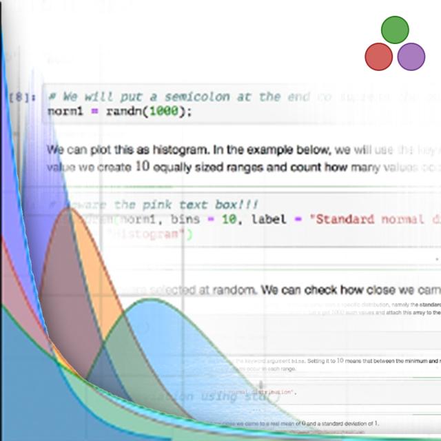
- Illustrate the distribution of data through visualizations
- Create specialized visualizations such as heat maps, correlograms, and mosaic plots
- Use R Markdown to create documents, reports, and presentations
Syllabus
WEEK 1
Creating Comparison and Composition Charts
Learn how to create comparison and composition charts.
WEEK 2
Creating Specialized Visualizations
Learn how to create specialized visualizations.
WEEK 3
Creating Specialized Visualizations
Learn how to create specialized visualizations.
WEEK 4
Communicating Data Using R Markdown
Learn how to export visualizations as commonly used document files.
WEEK5
Visualizing Data and Communicating Results with R Lab
Given a data set, create a chart that represents that data.