Data Storytelling with Power BI (Coursera)

Offered by Edureka,
Data Storytelling with Power BI (Coursera)

Welcome to the Data Storytelling with Power BI course, where you'll embark on a journey to acquire practical expertise in data transformation and visualization. Leverage the potential of Power BI to craft narratives through structured data, leading to the discovery of more profound insights. Throughout this course, you'll explore the industry-specific applications of Power BI and delve into its various features and functionalities.

Class Deals by MOOC List - Click here and see Coursera's Active Discounts, Deals, and Promo Codes.

By the end of this course, you’ll be able to:
• Explain the different data sources present in Power BI Desktop.
• Demonstrate the use of Power Query Editor to clean and transform data.
• Manipulate data with the DAX formula and depict stories by using different visualization techniques.
• Apply Power BI Service features to elevate the quality of your Reports and implement Dashboards on Power BI Service.
• Create Reports and Dashboards on Power BI service utilizing its prevalent features.
• Implement Smart Narrative and Key Performance Indicators to enhance reports for a target audience.
This course is designed for a diverse audience: freshers, data analyst, business analysts, business intelligence analyst and IT professionals who are looking to enhance their data analysis skills through Power BI.
Prior experience with Microsoft Excel or spreadsheet applications can be beneficial when working with Power BI.
Embark on an educational voyage to master Microsoft Power BI and enhance your skills in creating efficient Reports and Dashboards using the Power BI ecosystem.

Syllabus

Data Modeling and Transformation
In this module, you will explore the world of business intelligence and derive stories from data and present them to a targeted audience. You will also learn to identify and implement transformations in data for visualization with Power BI Desktop.

Data Analysis Expression (DAX)
In this module, you will learn to manipulate data with DAX formulas to create measures and columns, operate these transformations with the help of DAX functions, and create relationships to manage data.

Data Visualization
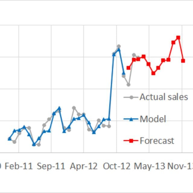
In this module, you will learn to create data visuals with the help of common charts and custom visuals and understand how they work. We will also learn about the best practices that are to be followed while building paginated reports and dashboards.

Power BI Service
In this module, you will learn about Power BI Service, make use of the features after publishing reports and dashboards on the Service interface, manage Smart Narrative, use Q & A to draw more insights from data, secure reports and dashboards with security roles, and observe data lineage.

Course Wrap Up and Assessment
This module is designed to assess an individual on the various concepts and teachings covered in this course. Answer a comprehensive quiz which marks you as a learner who is confident in working with Power BI.

Go to Class
MOOC List is learner-supported. When you buy through links on our site, we may earn an affiliate commission.

Related Courses

Data Visualization and Dashboards with Excel and Cognos (Coursera) Coursera
IBM

Data Visualization and Dashboards with Excel and Cognos (Coursera)

This course covers some of the first steps in the development of data visualizations using spreadsheets and dashboards. Begin the process of telling a story with your data by creating the many types of charts that are available in spreadsheets like Excel. Explore the different tools of a spreadsheet, such as the important pivot function and the ability to create dashboards and learn how each one has its own unique property to transform your data.

Jun 29th 2026
4 Weeks
Getting Started with Data Visualization in R (Coursera) Coursera
Johns Hopkins University

Getting Started with Data Visualization in R (Coursera)

Data visualization is a critical skill for anyone that routinely using quantitative data in his or her work - which is to say that data visualization is a tool that almost every worker needs today. One of the critical tools for data visualization today is the R statistical programming language. Especially in conjunction with the tidyverse software packages, R has become an extremely powerful and flexible platform for making figures, tables, and reproducible reports. However, R can be intimidating for first time users, and there are so many resources online that it can be difficult to sort through without guidance.

Jun 29th 2026
3 Weeks
Data Storytelling (Coursera) Coursera
University of California, Irvine

Data Storytelling (Coursera)

This course will cover the more complex concepts that become involved when working beyond simple datasets. Exploring the connection between visual aspects and data understanding, we will examine how those concepts work together through data storytelling. After reviewing key points on how to avoid problematic visualizations and data misrepresentation, you will continue working in Tableau performing multivariate descriptive analysis of the S&P 500 stock sectors.

Jun 29th 2026
4 Weeks
Demand Analytics (Coursera) Coursera
Rutgers University

Demand Analytics (Coursera)

Welcome to Demand Analytics - one of the most sought-after skills in supply chain management and marketing! Through the real-life story and data of a leading cookware manufacturer in North America, you will learn the data analytics skills for demand planning and forecasting.

Jun 29th 2026
4 Weeks
Understanding and Visualizing Data with Python (Coursera) Coursera
University of Michigan

Understanding and Visualizing Data with Python (Coursera)

In this course, learners will be introduced to the field of statistics, including where data come from, study design, data management, and exploring and visualizing data. Learners will identify different types of data, and learn how to visualize, analyze, and interpret summaries for both univariate and multivariate data. Learners will also be introduced to the differences between probability and non-probability sampling from larger populations, the idea of how sample estimates vary, and how inferences can be made about larger populations based on probability sampling.

Jun 29th 2026
4 Weeks
Share Data Through the Art of Visualization (Coursera) Coursera
Google

Share Data Through the Art of Visualization (Coursera)

This is the sixth course in the Google Data Analytics Certificate. These courses will equip you with the skills needed to apply to introductory-level data analyst jobs. You’ll learn how to visualize and present your data findings as you complete the data analysis process. This course will show you how data visualizations, such as visual dashboards, can help bring your data to life. You’ll also explore Tableau, a data visualization platform that will help you create effective visualizations for your presentations.

Jun 30th 2026
4 Weeks
Privacy Law and Data Protection (Coursera) Coursera
University of Pennsylvania

Privacy Law and Data Protection (Coursera)

What does it take to comply with privacy laws? In this course, we’ll look at the practical aspects of navigating the complex landscape of privacy requirements. Better understanding privacy laws and data protection will enable you to protect your organization and the constituents that depend on your organization to safeguard their personal information.

Jun 29th 2026
4 Weeks
Visualizing Data in the Tidyverse (Coursera) Coursera
Johns Hopkins University

Visualizing Data in the Tidyverse (Coursera)

Data visualization is a critical part of any data science project. Once data have been imported and wrangled into place, visualizing your data can help you get a handle on what’s going on in the data set. Similarly, once you’ve completed your analysis and are ready to present your findings, data visualizations are a highly effective way to communicate your results to others. In this course we will cover what data visualization is and define some of the basic types of data visualizations.

Jun 29th 2026
4 Weeks
Data Visualization Best Practices (Coursera) Coursera
University of California, Irvine

Data Visualization Best Practices (Coursera)

In this course, we will cover the basics of visualization and how it fits into the Data Science workflow. We will focus on the main concepts behind the purpose of visualization and the design principles for creating effective, easy-to-communicate results. You will also set up your Tableau environment, practice data loading, and perform univariate descriptive analysis of the S&P 500 stock sectors.

Jun 29th 2026
4 Weeks
Business Intelligence and Visual Analytics (Coursera) Coursera
University of California, Irvine

Business Intelligence and Visual Analytics (Coursera)

Building on “Data Warehousing and Business Intelligence,” this course focuses on data visualization and visual analytics. Starting with a thorough coverage of what data visualization is and what type of visualization is good for a given purpose, the course quickly dives into development of practical skills and knowledge about visual analytics by way of using one of the most popular visual analytics tools: SAS Viya, a cloud-based analytics platform. An overview of cloud architecture, automation, and machine learning is also provided.

Jun 29th 2026
4 Weeks
Everyday Excel, Part 3 (Projects) (Coursera) Coursera
University of Colorado Boulder

Everyday Excel, Part 3 (Projects) (Coursera)

"Everyday Excel, Part 3 (Projects)" is a continuation of "Everyday Excel, [Parts 1](https://www.mooc-list.com/course/everyday-excel-part-1-coursera) and [Parts 2](https://www.mooc-list.com/course/everyday-excel-part-2-coursera)". It is a capstone, projects-based course in which you will apply what you've learned previously to more complex, somewhat open-ended projects (open-ended with respect to the fact that they can be solved in multiple ways). Each learner must complete two easy projects (chosen from four), two intermediate projects (chosen from 4), and three main (more difficult) projects (chosen from 7).

Jun 29th 2026
5-12 Weeks