Data Visualization in Tableau (Udacity)

Offered by Udacity,
Data Visualization in Tableau (Udacity)

Learn the fundamentals of data visualization and practice communicating with data. This course covers how to apply design principles, human perception, color theory, and effective storytelling with data. If you present data to others, aspire to be a business analyst or data scientist, or if you’d like to become more effective with visualization tools, then you can grow your skills with this course.

Class Deals by MOOC List - Click here and see Udacity's Active Discounts, Deals, and Promo Codes.

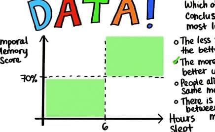
Data visualization skills are tremendously important in today’s data driven economy. Collecting and analysing data is just one step; to communicate your results to clients or your managers, you need to present the data in a coherent and intuitive way. Charts or graphs allow the human brain to visualize and understand large amounts of complex data.
This course will teach you to use data visualization to explore and understand data, and then communicate insights in a powerful and meaningful ways.
This course uses Tableau to create data visualizations. A 6-month educational license for Tableau is included free for Nanodegree students only.
This course is part of both the Business Analyst and Data Analyst Nanodegree Programs.

What You Will Learn

Lesson 1
Data Visualization Fundamentals

  • Learn why visualization is so important in analytics.
  • Learn about exploratory versus explanatory visualizations.
  • Get introduced to data types and ways to encode data.

Lesson 2
Design Principles

  • Use chart type, color, size, and shape to get the most out of data visualizations.
  • Learn about the importance of limiting the amount of data presented in an analysis.
  • Learn to use data with integrity.

Lesson 3
Creating Visualizations with Tableau

  • Do basic functions in Tableau, like inputting data and building charts.
  • Learn to use colors, shapes, and other tools to dig deep into data.
  • Learn to use calculations to create new data columns.

Lesson 4
Telling Stories with Tableau

  • Build Tableau dashboards.
  • Create visualizations to tell stories with data.

Prerequisites and Requirements
No programming experience required.
Interested in using data to make better business decisions.
Tableau license (provided to Nanodegree students at no cost).


Go to Class
MOOC List is learner-supported. When you buy through links on our site, we may earn an affiliate commission.

Related Courses

Diseño de Experiencia en Servicios (Coursera) Coursera
Universidad Austral

Diseño de Experiencia en Servicios (Coursera)

En la era de la comunicación, no siempre los servicios saben escuchar las necesidades profundas del cliente, ni tampoco es habitual que se innoven poniendo al cliente en el centro del proceso. ¿Qué técnicas de investigación de usuarios pueden ayudarte a mejorar un servicio? ¿Cómo entender a los usuarios y lo que buscan, y diseñar servicios que pongan sus necesidades como punto de partida? ¿Cómo lograr, a través de este diseño, que quieran crear una relación a largo plazo con la empresa?

Nov 9th 2026
4 Weeks
Visualization for Data Journalism (Coursera) Coursera
University of Illinois at Urbana-Champaign

Visualization for Data Journalism (Coursera)

While telling stories with data has been part of the news practice since its earliest days, it is in the midst of a renaissance. Graphics desks which used to be deemed as “the art department,” a subfield outside the work of newsrooms, are becoming a core part of newsrooms’ operation. Those people (they often have various titles: data journalists, news artists, graphic reporters, developers, etc.) who design news graphics are expected to be full-fledged journalists and work closely with reporters and editors.

Nov 2nd 2026
5-12 Weeks
Intro to Descriptive Statistics (Udacity) Udacity
Udacity

Intro to Descriptive Statistics (Udacity)

Mathematics for Understanding Data. Statistics is an important field of math that is used to analyze, interpret, and predict outcomes from data. Descriptive statistics will teach you the basic concepts used to describe data. This is a great beginner course for those interested in Data Science, Economics, Psychology, Machine Learning, Sports analytics and just about any other field.

Self Paced
Self-Paced
Gen AI for Code Generation for Python (Coursera) Coursera
Edureka

Gen AI for Code Generation for Python (Coursera)

Welcome to the 'Gen AI for Code Generation for Python' course, where you'll embark on a journey to explore and develop your skills in the art of code generation with Generative AI. Throughout this short course, you will delve into various techniques for generating Python code effortlessly, ranging from simple scripts to complete end-to-end projects.

Nov 9th 2026
1 Week
Data intelligence for businesses and managers (Coursera) Coursera
Institut Mines-Telecom

Data intelligence for businesses and managers (Coursera)

With the proliferation of connected objects (computers, tablets, watches, etc.), huge masses of data are generated every second. This Big Data has led to the emergence of a data economy, where data is the main source of competitive advantage for companies. In this sense, data and its processing tools have become a strategic priority for companies, and the main gas pedal of their digital transformation.

Nov 2nd 2026
5-12 Weeks
Open Design (Coursera) Coursera
Duke University

Open Design (Coursera)

What is design? How is it a deeply human endeavor? How can we design better products, services, and experiences in our communities? If you’re interested in helping create a more equitable and accessible world, this Center for Computational Thinking module on Open Design is for you.

Nov 9th 2026
1 Week
AutoLayout (Udacity) Udacity
Udacity

AutoLayout (Udacity)

Using Constraint-Based Design. With this course, you will learn about AutoLayout and how to use stack views and constraints to create pixel-perfect UIs. Also, you will take a deep dive and learn about some of the most commonly misunderstood properties affecting layout like distribution, alignment, content hugging, and compression resistance.

Self Paced
Self-Paced
Introduction to Data Visualization in Qlik Sense (Coursera) Coursera
Coursera Instructor Network

Introduction to Data Visualization in Qlik Sense (Coursera)

Data visualization is especially important today with the increased amount and velocity of data that companies capture daily, and a system is needed to ingest and make sense of all this data for improved decision-making. This course provides a comprehensive understanding of data visualization within the context of business intelligence.

Nov 9th 2026
1 Week
Principios esenciales de diseño en Tableau (Coursera) Coursera
Universidad Austral

Principios esenciales de diseño en Tableau (Coursera)

En este curso, analizarás y aplicarás principios de diseño esenciales para tus visualizaciones en Tableau. Este curso asume que comprendes las herramientas dentro de Tableau y tienes algún conocimiento de los conceptos fundamentales de visualización de datos. Definirás y examinarás las similitudes y diferencias del análisis exploratorio y estudio, así como comenzarás a hacerte las preguntas correctas sobre lo que se necesita en una visualización.

Nov 9th 2026
4 Weeks