Design and Make Infographics (Project-Centered Course) (Coursera)

Design and Make Infographics (Project-Centered Course) (Coursera)

In this project-centered course*, you will create a content-rich infographic on a topic of your choice using Adobe Illustrator (which you can download for a free, 30-day trial). You might choose to create a visual representation of data from the world of sports, entertainment, politics, or science, to explain a business trend or environmental issue, or even to present a theme or development from your personal life. Your finished infographic will engage your target audience and convey information clearly through effective use of design elements such as typography, color, and structure.

Class Deals by MOOC List - Click here and see Coursera's Active Discounts, Deals, and Promo Codes.

Whether you’re a graphic designer, a writer or the intern in the department, you’ll learn:
• what an infographic is and what makes a good one
• how to work within your limits
• how to work with a team (if you have one)
• why infographics are effective
• techniques for spotting data in stories
• six valuable steps for planning an effective infographic
• how to use and make some of the building blocks of infographics: maps, charts and flow charts
• ways data can be visualized to clarify it and give it meaning
• how to effectively design a good infographic by effectively using elements like type, color and an underlying grid structure
• some free or cheap, online tools for making various kinds of infographics
As you work on your project, you’ll learn more about why infographics are effective, what makes a good infographic, and how to plan and design an infographic for maximum impact. You’ll explore various approaches to data visualization, and you’ll practice creating visualizations like maps, charts, flow charts, and simple drawings in your free version of Adobe Illustrator. Please note that if you are new to learning graphics software, making these graphics could take much longer than estimated as you learn and grow.
What you’ll need to get started:
This project-based course is aimed at anyone interested in understanding, designing, and using infographics - from students and hobbyists to professional graphic designers.
*About Project-Centered Courses: Project centered courses are designed specifically to help you complete a personally meaningful real-world project, with your instructor and a community of like-minded learners providing guidance and suggestions along the way. By actively applying new concepts as you learn, you’ll master the course content more efficiently; you’ll also get a head start on using the skills you gain to make positive changes in your life and career. When you complete the course, you’ll have a finished project that you’ll be proud to use and share. When you enroll in certain courses, you’ll be asked to pay a small fee to share your work with others for peer review.

Syllabus

WEEK 1
Plan and layout an infographic
This week is broken into two key themes: things that you need to know about infographics and this week's two peer-reviewed assignments: 1) plan an infographic and 2) sketch a layout of your infographic.

WEEK 2
Make a chart
This week we're going to focus on three popular kinds of charts: bar, line and pie and you'll learn what kind of data each one is used for as well as some things you shouldn't do with them. The assignment this week is to make a chart using Adobe Illustrator. If learning graphic software is new to you, this could take you much more time than you think. In the fourth and final module of this project you will be creating an infographic that will contain at least one chart in it, so this might be a good point for you to think about what topic you would like to make your infographic about and then plot your chart here using data that you can apply to your infographic. I call them charts and I have for 30 years. You may call them whatever you like. ☺ Why Illustrator? It’s the industry standard for creating maps, charts and other graphic images. My Adobe Illustrator tutorial this week shows you how to make a pie chart, and the same styling and editing techniques will apply to the other chart types. If you prefer, here is a link to my tutorial for “How to Make a Bar Chart in Adobe Illustrator,” though. It’s not Illustrator CC, but you won’t be able to tell the difference and it’s a little more comprehensive than my pie chart tutorial.

WEEK 3
Make a map

WEEK 4
Make an infographic
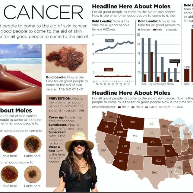
You've learned some things about content, layout, design, color and making maps and charts and now it's time to pull them all together into an infographic. It will help if you review my video from module one where I make an infographic (the one on melanoma) from start to finish. I have a tutorial here that will show you how to draw an illustration in Illustrator, in case your infographic calls for one. I hope you try it!

Go to Class
MOOC List is learner-supported. When you buy through links on our site, we may earn an affiliate commission.

Related Courses

Cree Increíbles Diseños de Mercadeo usando Canva (Coursera) Coursera
Coursera Project Network

Cree Increíbles Diseños de Mercadeo usando Canva (Coursera)

Al final del Proyecto usted podrá crear un gráfico/diseño de ejemplo/muestra de redes sociales para empresas. El gráfico se puede compartir en las plataformas de redes sociales de su empresa. Podrá incorporar la paleta de colores de su guía de estilo empresarial para crear el reconocimiento de la marca como parte de su estrategia de mercadeo en redes sociales.

Aug 24th 2026
Self-Paced
Google Sheets - Advanced Topics (Coursera) Coursera
Google Cloud

Google Sheets - Advanced Topics (Coursera)

This course builds on some of the concepts covered in the earlier Google Sheets course. In this course, you will learn how to apply and customize themes In Google Sheets, and explore conditional formatting options. You will learn about some of Google Sheets’ advanced formulas and functions. You will explore how to create formulas using functions, and you will also learn how to reference and validate your data in a Google Sheet.

Aug 24th 2026
1 Week
Create a Storyboard using Canva (Coursera) Coursera
Coursera Project Network

Create a Storyboard using Canva (Coursera)

By the end of this project, you will learn how to create a storyboard from scratch using the free version of Canva. Storyboards are sequential breakdowns of each shot for a visual presentation. A visual presentation can include animation, live-action video, sales and marketing pitches. We can use Canva to complete this project because it provides all the tools you need to create an organized and visually appealing product while offering a variety of options for sharing and collaboration.

Aug 24th 2026
Self-Paced
Introducción al diseño de Mercadeo con Canva (Coursera) Coursera
Coursera Project Network

Introducción al diseño de Mercadeo con Canva (Coursera)

Al final de este proyecto, usted creará dos anuncios de Redes Sociales: uno para Facebook, y uno para Instagram. Usted aprenderá a crear anuncios de medios sociales con Canva para su empresa. Podrá incorporar el esquema de colores de su empresa para crear un sentimiento de identificación y reconocimiento en las redes sociales como estrategia de marketing. En este proyecto usaremos la versión gratis de Canva.

Aug 24th 2026
Self-Paced
Comercialice su nuevo negocio con Canva (Coursera) Coursera
Coursera Project Network

Comercialice su nuevo negocio con Canva (Coursera)

Al final de este proyecto, usted habrá aprendido a comercializar y anunciar su nuevo negocio usando Canva. Usted creará un logotipo de la empresa, una tarjeta de presentación y un folleto usando Canva. Crearemos diseños desde cero y usaremos plantillas que modificaremos. Usted podrá incorporar un esquema de color , imágenes, y otros elementos de diseño estético. En este proyecto usaremos la versión gratis de Canva.

Aug 24th 2026
Self-Paced
Google Slides (Coursera) Coursera
Google Cloud

Google Slides (Coursera)

With Google Slides, you can create and present professional presentations for sales, projects, training modules, and much more. Google Slides presentations are stored safely in the cloud. You build presentations right in your web browser—no special software is required. Even better, multiple people can work on your slides at the same time, you can see people’s changes as they make them, and every change is automatically saved. You will learn how to open Google Slides, create a blank presentation, and create a presentation from a template. You will explore themes, layout options, and how to add and format content, and speaker notes in your presentations.

Aug 31st 2026
1 Week
Fundamentals of Graphic Design (Coursera) Coursera
California Institute of the Arts

Fundamentals of Graphic Design (Coursera)

Graphic Design is all around us! Words and pictures—the building blocks of graphic design—are the elements that carry the majority of the content in both the digital world and the printed world. As graphic design becomes more visible and prevalent in our lives, graphic design as a practice becomes more important in our culture. Through visual examples, this course will teach you the fundamental principles of graphic design: imagemaking, typography, composition, working with color and shape... foundational skills that are common in all areas of graphic design practice.

Aug 24th 2026
4 Weeks
Healthcare Information Design and Visualizations (Coursera) Coursera
Northeastern University

Healthcare Information Design and Visualizations (Coursera)

Introduces processes and design principles for creating meaningful displays of information that support effective business decision-making. Studies how to collect and process data; create visualizations (both static and interactive); and use them to provide insight into a problem, situation, or opportunity. Introduces methods to critique visualizations along with ways to answer the elusive question: “What makes a visualization effective?”

Sep 7th 2026
4 Weeks
Construction Scheduling (Coursera) Coursera
Columbia University

Construction Scheduling (Coursera)

Learners will discover the key project scheduling techniques and procedures including; how to create a network diagram, how to define the importance of the critical path in a project network, and defining project activities float. Also covered are the fundamentals of Bar Charts, Precedence Diagrams, Activity on Arrow, PERT, Range Estimating, and linear project operations and the line of balance.

Aug 24th 2026
5-12 Weeks
Visual Elements of User Interface Design (Coursera) Coursera
California College of the Arts

Visual Elements of User Interface Design (Coursera)

This design-centric course examines the broad question of what an interface is and what role a designer plays in creating a user interface. Learning how to design and articulate meaning using color, type, and imagery is essential to making interfaces function clearly and seamlessly. Through a series of lectures and visual exercises, you will focus on the many individual elements and components that make up the skillset of an interface designer. By the end of this course, you will be able to describe the key formal elements of clear, consistent, and intuitive UI design, and apply your learned skills to the design of a static screen-based interface.

Aug 24th 2026
4 Weeks
Build Customizable Sales Presentation Graphics using Canva (Coursera) Coursera
Coursera Project Network

Build Customizable Sales Presentation Graphics using Canva (Coursera)

By the end of this project, you will have the ability to develop and design a target market analysis graphic, a sales CRM workflow graphic, and a data chart graphic using Canva. A web-based graphic design tool, Canva offers free accounts with broad access to facilitate visual content development. The learner will develop graphics appropriate for use in sales presentations and any other presentations the user deems appropriate.

Aug 24th 2026
Self-Paced
Visual Analytics with Tableau (Coursera) Coursera
University of California, Davis

Visual Analytics with Tableau (Coursera)

In this third course of the specialization, we’ll drill deeper into the tools Tableau offers in the areas of charting, dates, table calculations and mapping. We’ll explore the best choices for charts, based on the type of data you are using. We’ll look at specific types of charts including scatter plots, Gantt charts, histograms, bullet charts and several others, and we’ll address charting guidelines.

Aug 24th 2026
4 Weeks