EdX

Visualización y manipulación de datos con Tableau (edX)

Visualización y manipulación de datos con Tableau (edX)

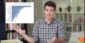
Mejora tus competencias de gestión de datos con Tableau y construye las visualizaciones. Los contenidos de este curso se han pensado para permitir que los usuarios de Tableau mejoren a un nivel intermedio las propias capacidades en el empleo de la herramienta. En los precedentes módulos, hemos presentado los conceptos fundamentales para trabajar con Tableau y analizar los propios datos. Una vez madurados estos conocimientos, estamos listos para continuar el recorrido de aprendizaje de Tableau, para mejorar la calidad y la complejidad de nuestros análisis. Este curso intermedio presenta cuatro nuevos módulos, divididos tal y como se describen a continuación.

Class Deals by MOOC List - Click here and see EdX's Active Discounts, Deals, and Promo Codes.

El módulo 1 se dedica al tema de combinación de datos. Los datos llegan, a menudo, de distintas fuentes por lo que tenemos que ser capaces de establecer relaciones entre estos para poder incluir en un análisis toda la información que necesitamos. Por lo tanto, veremos cómo construir estas relaciones en Tableau, utilizando Combinación, Unión y Combinación de datos.
En el módulo 2 trabajaremos con los campos calculados y los parámetros. Los primeros son nuevos campos (dimensiones y medidas) que, a partir de la lógica utilizada, añaden nuevos datos a la base de datos inicial. Por su parte, los segundos son valores dinámicos que se pueden emplear de tantísimas formas para personalizar los propios cálculos y su visualización al interno del espacio de trabajo.
El módulo 3 contiene todos los conocimientos útiles para llevar a cabo operaciones a nivel visual. En este módulo veremos cómo Tableau lleva a cabo las operaciones de cálculo siguiendo un orden preciso que influye en los resultados de los cálculos que hacemos.
Por último, en el módulo 4 trabajaremos con los datos geográficos. En el proceso analítico hay distintas preguntas que podemos hacernos. Dominando los conocimientos relativos a la manipulación de los datos geográficos podemos responder al “cuándo”, un aspecto fundamental que se debe considerar en el proceso analítico.
This course is part of the Visualización de datos: Análisis de datos con Tableau Professional Certificate.

What you'll learn

  • Combinación de datos
  • Campos calculados y parámetros
  • Las visualizaciones
  • Los datos geográficos
Go to Class
MOOC List is learner-supported. When you buy through links on our site, we may earn an affiliate commission.

Related Courses

Social Media Analytics: Using Data to Understand Public Conversations (FutureLearn) FutureLearn
Queensland University of Technology

Social Media Analytics: Using Data to Understand Public Conversations (FutureLearn)

How can you discover what’s being said about the things that matter to you on social media platforms, including Twitter? What are tweets and the cultural politics of Twitter? Learn to use TAGS and discuss the implications of accessing social media data. What are the pros and cons of analysing social media data in real time? Learn how to use Tableau to analyse data, identify trends and patterns and explore how social media have been used in times of crisis and during political campaigns.

No sessions available
3 Weeks
Foundations: Data, Data, Everywhere (Coursera) Coursera
Google

Foundations: Data, Data, Everywhere (Coursera)

This is the first course in the Google Data Analytics Certificate. These courses will equip you with the skills you need to apply to introductory-level data analyst jobs. Organizations of all kinds need data analysts to help them improve their processes, identify opportunities and trends, launch new products, and make thoughtful decisions. In this course, you’ll be introduced to the world of data analytics through hands-on curriculum developed by Google. The material shared covers plenty of key data analytics topics, and it’s designed to give you an overview of what’s to come in the Google Data Analytics Certificate. Current Google data analysts will instruct and provide you with hands-on ways to accomplish common data analyst tasks with the best tools and resources.

Jun 16th 2026
5-12 Weeks
Share Data Through the Art of Visualization (Coursera) Coursera
Google

Share Data Through the Art of Visualization (Coursera)

This is the sixth course in the Google Data Analytics Certificate. These courses will equip you with the skills needed to apply to introductory-level data analyst jobs. You’ll learn how to visualize and present your data findings as you complete the data analysis process. This course will show you how data visualizations, such as visual dashboards, can help bring your data to life. You’ll also explore Tableau, a data visualization platform that will help you create effective visualizations for your presentations.

Jun 16th 2026
4 Weeks
Data Visualization in Tableau (Udacity) Udacity
Udacity

Data Visualization in Tableau (Udacity)

Learn the fundamentals of data visualization and practice communicating with data. This course covers how to apply design principles, human perception, color theory, and effective storytelling with data. If you present data to others, aspire to be a business analyst or data scientist, or if you’d like to become more effective with visualization tools, then you can grow your skills with this course.

Self Paced
Self-Paced
Tableau - Tableau Accelerated Program and Platform Architecture (Skillshare) Skillshare
Skillshare

Tableau - Tableau Accelerated Program and Platform Architecture (Skillshare)

In this short course, I'll show you what Tableau is, how it fits into our lives and finally the basic functions you'll need to get started with this amazing Business Intelligence Solution. You'll hear the explanation that Tableau is Excel on steroids. This explanation isn't the best. I like to think of it as Excel being a car and Tableau being a Boeing 747.

Self Paced
Self-Paced
Data Visualisation: Creating Charts and Complex Visualisations in Tableau (FutureLearn) FutureLearn
FutureLearn

Data Visualisation: Creating Charts and Complex Visualisations in Tableau (FutureLearn)

Learn the fundamentals of data visualisation and storytelling to boost your career options. Struggling to turn data insights into action within your organisation? Learn how to identify the right metrics to add to data dashboards and identify the most effective components to help you tell data stories through beautiful visualisations. This course will take you from theory into practice. You’ll build the skills you need to create interactive dashboards using Tableau.

May 23rd 2022
4 Weeks
Data Representation and Visualization in Tableau (edX) EdX
Rochester Institute of Technology,RITx

Data Representation and Visualization in Tableau (edX)

Use Tableau to explore data and discover insights to innovate data-driven decision-making.Use Tableau to explore data and discover insights to innovate data-driven decision-making. Employer demand for Tableau skills will grow 35% over the next 10 years. Whether you are in a data-centric role or just need to add data skills to take your job or career to the next level, this course will provide the foundation and skills to get started using one of today’s most impactful data visualization tools.

Self Paced
Self-Paced
Introducción a la visualización de datos con Tableau (edX) EdX
University of Naples Federico II,FedericaX

Introducción a la visualización de datos con Tableau (edX)

Conviértete en un profesional de la Inteligencia Empresarial con Tableau. Este curso se orienta a la formación de profesionales en Inteligencia Empresarial mediante el aprendizaje de la plataforma Tableau, instrumento líder del sector. Tableau permite ayudar a las que personas vean y entiendan los propios datos.

Self Paced
Self-Paced
Data Visualization with Tableau Project (Coursera) Coursera
University of California, Davis

Data Visualization with Tableau Project (Coursera)

In this project-based course, you will follow your own interests to create a portfolio worthy single-frame viz or multi-frame data story that will be shared on Tableau Public. You will use all the skills taught in this Specialization to complete this project step-by-step, with guidance from your instructors along the way.

Jun 15th 2026
5-12 Weeks
Data Visualization and Communication with Tableau (Coursera) Coursera
Duke University

Data Visualization and Communication with Tableau (Coursera)

One of the skills that characterizes great business data analysts is the ability to communicate practical implications of quantitative analyses to any kind of audience member. Even the most sophisticated statistical analyses are not useful to a business if they do not lead to actionable advice, or if the answers to those business questions are not conveyed in a way that non-technical people can understand. In this course you will learn how to become a master at communicating business-relevant implications of data analyses.

Jun 15th 2026
5-12 Weeks
Advanced Data Visualization with Tableau (Coursera) Coursera
Tableau Learning Partner

Advanced Data Visualization with Tableau (Coursera)

The Advanced Data Visualization with Tableau Course teaches you how to create advanced data visualizations such as dual-axis charts, bar-in-bar charts, and more. You will also learn how to customize and add complexity to your visualizations by incorporating the use of features such as maps, map customization, polygon spatial data, and more. These skills will allow you to effectively communicate insights to your stakeholders.

Jun 15th 2026
3 Weeks