EdX

Visualizing Data with R (edX)

Offered by IBM,
Visualizing Data with R (edX)

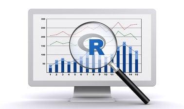
Learn about the ggplot2 data visualization package for R, creating map plots with geolocation data using Leaflet, and interactive dashboards to display your work on the web using the R Shiny package!
In this course, you will learn about the Grammar of Graphics, a system for describing and building graphs, and how the ggplot2 data visualization package for R applies this concept to basic bar charts, histograms, pie charts, scatter plots, line plots, and box plots.

Class Deals by MOOC List - Click here and see EdX's Active Discounts, Deals, and Promo Codes.

You will also learn how to further customize your charts and plots using themes and other techniques. You will then learn how to use another R data visualization package called Leaflet to create map plots, a unique way to plot data based on geolocation data. Finally, you will learn about creating interactive dashboards using the R Shiny package. You will learn how to create and customize Shiny apps, alter the appearance of the apps by adding HTML and image components, and deploy your interactive data apps on the web.
You will practice what you learn and build hands-on experience by completing labs in each module and a final project at the end of the course. Enroll in the course, watch the videos, work through the labs, and then watch your data science skills grow!
NOTE: This course requires knowledge of working with R and data. If you do not have these skills, it is highly recommended that you first take the Introduction to R Programming for Data Science as well as the Data Analysis with R courses from IBM prior to starting this course.

This course is part of the Data Analytics and Visualization with Excel and R Professional Certificate and Applied Data Science with R Professional Certificate

What you'll learn

  • Create basic bar charts, histograms, pie charts, scatter plots, line plots, box plots, and maps using R and related packages, such as ggplot2.
  • Customize charts and plots using themes and faceting.
  • Create maps using the Leaflet package for R.
  • Create interactive dashboards using the Shiny package for R.
Go to Class
MOOC List is learner-supported. When you buy through links on our site, we may earn an affiliate commission.

Related Courses

Storytelling and Persuading using Data and Digital Technologies (edX) EdX
University of Maryland, College Park,University System of Maryland - USM,USMx,UMD

Storytelling and Persuading using Data and Digital Technologies (edX)

Learn how to gain traction for your digital transformation initiatives with stories based on data that use compelling data visualizations to build a persuasive business case. Decisions made by humans are rarely made by data alone. Human decision-makers have cognitive biases, are affected by emotions, and make conceptual leaps beyond what the data may suggest.

Self Paced
Self-Paced
Data Visualization & Cloud Technologies (edX) EdX
University of Wisconsin–Madison,WisconsinX

Data Visualization & Cloud Technologies (edX)

Learn to use data visualization and cloud technologies for business analytics. In this course, gain experience in data visualization and cloud technologies to support business analytics. In the first half of the course, create and share compelling data visualizations to enhance decision-making. In the second half of the course, use cloud technologies to build scalable data warehouses, analyze big data, and develop and deploy machine learning models.

Mar 18th 2024
5-12 Weeks
Data Science Tools (edX) EdX
IBM

Data Science Tools (edX)

Learn about the most popular data science tools, including how to use them and what their features are. In this course, you'll learn about Data Science tools like Jupyter Notebooks, RStudio IDE, and Watson Studio. You will learn what each tool is used for, what programming languages they can execute, their features and limitations and how data scientists use these tools today.

Self Paced
Self-Paced
Data Representation and Visualization in Tableau (edX) EdX
Rochester Institute of Technology,RITx

Data Representation and Visualization in Tableau (edX)

Use Tableau to explore data and discover insights to innovate data-driven decision-making.Use Tableau to explore data and discover insights to innovate data-driven decision-making. Employer demand for Tableau skills will grow 35% over the next 10 years. Whether you are in a data-centric role or just need to add data skills to take your job or career to the next level, this course will provide the foundation and skills to get started using one of today’s most impactful data visualization tools.

Self Paced
Self-Paced
Visualizing Data with Python (edX) EdX
IBM

Visualizing Data with Python (edX)

Data visualization is the graphical representation of data in order to interactively and efficiently convey insights to clients, customers, and stakeholders in general. "A picture is worth a thousand words." We are all familiar with this expression. It especially applies when trying to explain the insights obtained from the analysis of increasingly large datasets. Data visualization plays an essential role in the representation of both small and large-scale data. One of the key skills of a data scientist is the ability to tell a compelling story, visualizing data and findings in an approachable and stimulating way.

Self Paced
Self-Paced
Statistical Thinking for Data Science and Analytics (edX) EdX
Columbia University,ColumbiaX

Statistical Thinking for Data Science and Analytics (edX)

Learn how statistics plays a central role in the data science approach. This statistics and data analysis course will pave the statistical foundation for our discussion on data science. You will learn how data scientists exercise statistical thinking in designing data collection, derive insights from visualizing data, obtain supporting evidence for data-based decisions and construct models for predicting future trends from data.

Self Paced
Self-Paced
R Data Science Capstone Project (edX) EdX
IBM

R Data Science Capstone Project (edX)

Apply various data analysis and visualization skills and techniques you have learned by taking on the role of a data scientist working with real-world data sets. In this capstone course, you will apply various data science skills and techniques that you have learned as part of the previous courses in the IBM Data Science with R or IBM Data Analytics with Excel and R Professional Certificate Programs.

Self Paced
Self-Paced
Essentials of Data Literacy (edX) EdX
Davidson College,DavidsonX

Essentials of Data Literacy (edX)

Learn how to read, work with, and analyze data. Future-proof your career. In this course, you will practice analyzing, visualizing, and communicating with data, using real datasets and examples that are relevant to a variety of audiences and academic disciplines. Data is part of every field, but not everyone has had the opportunity to gain the skills necessary to find the data they need and use it in ways that add to their work.

Self Paced
Self-Paced
Advanced Statistical Inference and Modelling Using R (edX) EdX
University of Canterbury,UCx

Advanced Statistical Inference and Modelling Using R (edX)

Extend your knowledge of linear regression to the situations where the response variable is binary, a count, or categorical as well as to hierarchical experimental set-up. Advanced Statistical Inference and Modelling Using R is part two of the Statistical Analysis in R professional certificate. This course is directed at people who are already familiar with basic linear regression and fundamentals of statistical inference. It extends the knowledge of linear regression to the situations where the response variable is binary, a count, or categorical as well as to hierarchical experimental set-up.

Self Paced
Self-Paced
Analyzing Data with R (edX) EdX
IBM

Analyzing Data with R (edX)

R is the key that opens the door between the problems you want to solve with data and the answers you need. This course walks you through the process of answering questions through data. The R programming language is purpose-built for data analysis. R is the key that opens the door between the problems you want to solve with data and the answers you need to meet your objectives.

Self Paced
Self-Paced